In the previous article, we have added a date picker in our CRUD application using Angular Material. Currently we are not showing any confirmation dialog for deleting records. In this article, we are gonna create a reusable confirmation dialog using Angular Material to display a delete confirmation to the user.
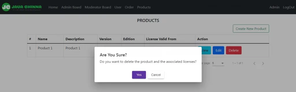
What You’ll Build
Angular Frontend
List Page
What You’ll Need
- node.js, npm and ancular-cli
- Spring Boot + Angular Application Source Code
Angular Client Implementation
Create Confirmation Dialog Component
The MatDialog service can be used to open modal dialogs with Material Design styling and animations. Components created via MatDialog can inject MatDialogRef and use it to close the dialog in which they are contained.
So, in order to create a reusable confirmation dialog component, we need MatDialogRef and MAT_DIALOG_DATA.
The MatDialogRef is the reference to a dialog opened via the MatDialog service. It provides a handle on the opened dialog which will be used to close the dialog and to receive notifications after the dialog is closed. Moreover, any notification Observables will complete when the dialog closes.
The MAT_DIALOG_DATA is an injection token that can be used to access the data that was passed in to a dialog. We will use this data option to customize the message and button text based on different use cases. So that we can reuse the same component throughout the application instead of creating a separate dialog component for each and every use case.
confirmation-dialog.component.ts
Let’s create a component as mentioned below:
- Import
MatDialogRefandMAT_DIALOG_DATAand declare a constructor with these 2 parameters. - Declare 3 fields namely
message,confirmButtonText&cancelButtonTextwith default values. In the constructor, if thedatais available, then override these default values with the one provided in thedataparameter. - Define
onConfirmClick()method and bind it to the confirm button in the dialog. So that, when the user clicks on the confirm button, the dialog will be closed and result valuetruewill be forwarded as the result ofafterClosedObservable.
import { Component, Inject } from '@angular/core';
import { MatDialogRef, MAT_DIALOG_DATA } from '@angular/material/dialog';

@Component({templateUrl: 'confirmation-dialog.component.html'})
export class ConfirmationDialog {
	message: string = "Are you sure want to delete?"
	confirmButtonText = "Yes"
	cancelButtonText = "Cancel"
	constructor(@Inject(MAT_DIALOG_DATA) private data: any,	private dialogRef: MatDialogRef<ConfirmationDialog>) {
		if(data){
			this.message = data.message || this.message;
			if (data.buttonText) {
				this.confirmButtonText = data.buttonText.ok || this.confirmButtonText;
				this.cancelButtonText = data.buttonText.cancel || this.cancelButtonText;
			}
		}
	}

	onConfirmClick(): void {
		this.dialogRef.close(true);
	}
}
confirmation-dialog.component.html
Several directives are available to make it easier to structure our dialog content. We will use <mat-dialog-content> and <mat-dialog-actions> directives.
- The
<mat-dialog-content>directive is used for the primary scrollable content of the dialog. - The
<mat-dialog-actions>directive is used for the action buttons container at the bottom of the dialog. Button alignment can be controlled via thealignattribute which can be set toendandcenter.
<h5>Are You Sure?</h5>
<mat-dialog-content>
<p>{{message}}</p>
</mat-dialog-content>
<mat-dialog-actions align="center">
<button mat-raised-button color="primary" (click)="onConfirmClick()" tabindex="1">{{confirmButtonText}}</button>
<button mat-raised-button mat-dialog-close tabindex="-1">{{cancelButtonText}}</button>
</mat-dialog-actions>
Modify Product List Component
A dialog is opened by calling the open method with a component to be loaded and an optional config object. Here, the component to be loaded is our ConfirmationDialog and the config object will contain our MAT_DIALOG_DATA with the custom message. The open method will return an instance of MatDialogRef.
const dialogRef = this.dialog.open(ConfirmationDialog,{
		data:{
			message: 'Do you want to delete the product and the associated licenses?'
		}
		});
Note: You can also change the default button text by providing it along with the message in the data object.
Further, when closing, an optional result value can be provided. This result value is forwarded as the result of the afterClosed Observable. If the result value is true, then we will perform the actual operation for which the user has given confirmation. In our case, we will call the deleteProduct() method to perform the delete operation.
dialogRef.afterClosed().subscribe((confirmed: boolean) => {
			if (confirmed) {
				this.deleteProduct(id);
			}
		});
list.component.ts
Let’s modify this component to do the following changes:
- Import
MatDialogservice and theConfirmationDialogcomponent. - Add the
MatDialogservice to the constructor. - Define a method called
openDialog(id:number)method and bind it to the delete button in the UI.
import { Component, OnInit } from '@angular/core';
import { ProductService } from '../_services/product.service';
import { Product } from './product';
import { PageEvent } from '@angular/material/paginator';
import { MatDialog } from '@angular/material/dialog';
import { ConfirmationDialog } from './../dialog/confirmation-dialog.component';

@Component({templateUrl: './list.component.html'})
export class ProductListComponent implements OnInit {

	products: Product[] = [];
	totalElements: number = 0;

	constructor(public productService: ProductService, private dialog: MatDialog) {
	}

	ngOnInit(): void {
		this.getProducts({ page: "0", size: "5" });
	}

	private getProducts(request) {
		this.productService.getAll(request)
		.subscribe(data => {
			this.products = data['content'];
			this.totalElements = data['totalElements'];
		}
		, error => {
			console.log(error.error.message);
		}
		);
	}

	nextPage(event: PageEvent) {
		const request = {};
		request['page'] = event.pageIndex.toString();
		request['size'] = event.pageSize.toString();
		this.getProducts(request);
	}

	deleteProduct(id:number){
		this.productService.delete(id)
		.subscribe(data => {
			this.products = this.products.filter(item => item.id !== id);
			console.log('Product deleted successfully!');
		}
		, error => {
			console.log(error.error.message);
		}
		);
	}

	openDialog(id:number) {
		const dialogRef = this.dialog.open(ConfirmationDialog,{
		data:{
			message: 'Do you want to delete the product and the associated licenses?'
		}
		});

		dialogRef.afterClosed().subscribe((confirmed: boolean) => {
			if (confirmed) {
				this.deleteProduct(id);
			}
		});
	}
}
list.component.html
When the delete button is clicked, we need to call the openDialog(product.id) method instead of calling the deleteProduct(product.id) method directly in order to display the confirmation dialog. Upon user confirmation, we will execute the delete operation.
<tr scope="row" *ngFor="let product of products">
					<td>{{ product?.id }}</td>
					<td>{{ product?.name }}</td>
					<td>{{ product?.description}}</td>
					<td>{{ product?.version }}</td>
					<td>{{ product?.edition }}</td>
					<td>{{ product?.validFrom | date: 'dd/MM/yyyy'}}</td>
					<td><a href="#" [routerLink]="['/products/', product.id, 'view']" class="btn btn-info m-1">View</a> <a href="#"
							[routerLink]="['/products/', product.id, 'edit']" class="btn btn-primary m-1">Edit</a>
						<button type="button" (click)="openDialog(product.id)" class="btn btn-danger m-1">Delete</button></td>
				</tr>
Define Module
app.module.ts
Import and add MatDialogModule, MatButtonModule and ConfirmationDialog in the module declarations.
import { BrowserModule } from '@angular/platform-browser';
import { NgModule } from '@angular/core';

import { AppRoutingModule } from './app-routing.module';
import { FormsModule, ReactiveFormsModule } from '@angular/forms';
import { HttpClientModule } from '@angular/common/http';
import { MatPaginatorModule } from '@angular/material/paginator';
import { MatDatepickerModule } from '@angular/material/datepicker';
import { MatInputModule } from '@angular/material/input';
import { MomentDateModule } from '@angular/material-moment-adapter';
import { MatDialogModule } from '@angular/material/dialog';
import { MatButtonModule } from '@angular/material/button';
import { AppComponent } from './app.component';
import { LoginComponent } from './login/login.component';
import { RegisterComponent } from './register/register.component';
import { HomeComponent } from './home/home.component';
import { ProfileComponent } from './profile/profile.component';
import { BoardAdminComponent } from './board-admin/board-admin.component';
import { BoardModeratorComponent } from './board-moderator/board-moderator.component';
import { BoardUserComponent } from './board-user/board-user.component';
import { TotpComponent } from './totp/totp.component';
import { OrderComponent } from './order/order.component';
import { TokenComponent } from './register/token.component';
import { ProductListComponent } from './products/list.component';
import { ProductViewComponent } from './products/view.component';
import { ProductAddEditComponent } from './products/add-edit.component';

import { ConfirmationDialog } from './dialog/confirmation-dialog.component';
import { authInterceptorProviders } from './_helpers/auth.interceptor';
import { BrowserAnimationsModule } from '@angular/platform-browser/animations';

@NgModule({
  declarations: [
    AppComponent,
    LoginComponent,
    RegisterComponent,
    HomeComponent,
    ProfileComponent,
    BoardAdminComponent,
    BoardModeratorComponent,
    BoardUserComponent,
    TotpComponent,
    OrderComponent,
    TokenComponent,
	ProductListComponent,
    ProductViewComponent,
    ProductAddEditComponent,
    ConfirmationDialog
  ],
  imports: [
    BrowserModule,
    AppRoutingModule,
    FormsModule,
	ReactiveFormsModule,
    HttpClientModule,
    MatPaginatorModule,
    MatDatepickerModule,
    MatInputModule,
    MomentDateModule,
    MatDialogModule,
    MatButtonModule,
    BrowserAnimationsModule
  ],
  providers: [authInterceptorProviders],
  bootstrap: [AppComponent]
})
export class AppModule { }
Run the Angular App
You can run this App with the below command and hit the URL http://localhost:8081/ in browser
ng serve --port 8081
Source Code
https://github.com/JavaChinna/angular-confirmation-dialog
Conclusion
That’s all folks. In this article, we have implemented a confirmation dialog using Angular Material in our CRUD application.
Thank you for reading.


